Local sub-theme definitions - CSS
Description
Define the CSS for any locally defined sub-themes. Sub-themes are used to create a custom appearance for certain types such as windows, buttons, tabs, accordions, sliders, switches, etc.
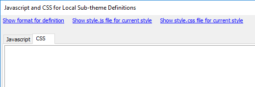
The 'Local sub-theme definitions - CSS' property opens the 'Javascript and CSS for Local Sub-theme Definitions' dialog. This dialog can also be opened from the 'Local sub-theme definitions - Javascript' property. In order to define a custom sub-theme it is usually necessary to define both of these properties. The javascript part of the definition calls different CSS classes for a given control type; to be used for different events related to that control. In most cases this code can simply be copied from the existing javascript that defines the pre-existing sub-themes for the current style type. The Local sub-theme definitions - Javascript page contains instructions on how to do this.
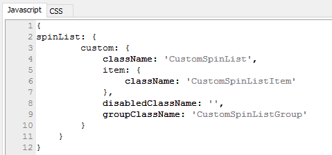
After the css class to be called for a given control has been defined in the Javascript tab, you can copy names of the new classes to define into the CSS tab. CSS classes start with a period '.' and end in curly brackets
.CSS_class_name {}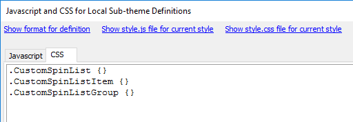
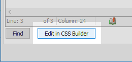
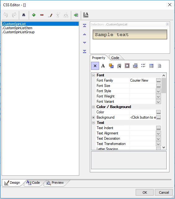
When CSS classes for the sub-theme have a name, the settings for that class can then be defined. This can be done either by hand or by clicking the 'Edit in CSS Builder' builder at the bottom of the dialog.
You can use the 'Design' tab in the builder to edit the CSS classes by simply adjusting style property settings. This makes it easy to set specific colors, fonts, amounts of padding, and so on.
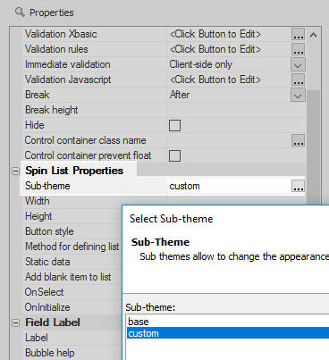
Once you have defined a sub-theme for a given control type you should be able to select it in the 'Sub-theme' property for that control type on the UX controls page. For example, here is a spin control 'Sub-theme' property.